Web design for art gallery, ®edux.
The challenge of designing a website for Redux, was to present large swathes of text without becoming dull. So we found a way to retain the gallery's identity.


The client
®edux
Unit 303, Third Floor, Lana House
116 Commercial Street
London E1 6NF
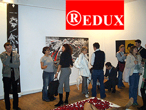
Started in 2003 by Peter Lewis, Makiko Nagaya and Simon Gee, the gallery hosts events, seminars and exhibitions for challenging, experimental and contemporary art.
Peter Lewis was nominated for a Hamlyn Foundation award in 2004 and ®edux has been nominated for an Arts Foundation Award 2004-2005.
The brief
The site required an uncomplicated style, incorporating ®edux' visual identity.
The site would comprise numerous and often lengthy articles or press releases, which would in some cases, be accompanied by photos. Additional pages for contacting and locating the gallery were needed.
The site would also hold numerous photos of events and artists' work, presented in picture gallery pages.
Our approach
Initial requirements were discussed in a meeting with Peter and Makiko at ®edux, in summer 2004. The aim was to understand who their target audience would be and most importantly, what ®edux needed the website to accomplish.
We talked aesthetics, discussed styles that Peter and Makiko liked personally, and established a design direction. A consensus grew around the philosophy of reduction. Further inspiration came from books and magazines that Peter and Makiko admired, and old Blue Note record sleeves. The treatment of gallery event photography rounded off our discussions, we had our guides.
Visual themes were compiled, and design rules were formulated: image placement; allocation of text; use of negative space; colours to use and colours to avoid. The web design was underpinned by these ideas.
Development
The site's primary content would relate to the events and exhibitions held at ®edux. As such, the Events index became the linchpin of the site's simple architecture, with the Guests & Artists index supplementing the features and press releases, acting as a directory for the site.
We also optimized readability by keeping graphics and embellishments to an absolute minimum. Visitors' attention would be focussed mainly on the body text of press releases providing commentary on their events. By simplifying the look & feel in favour of text, readers could focus on content.
To boost the appeal of pages featuring large volumes of text, that offered nothing else in the way of visual flamboyance to distract readers, the text itself would be treated in a way that made it stand out.
In a novel deviation from conventional body-text style, ®edux' page text would incorporate the logo-colour into all of the site's punctuation. Not so much that it would distract from the writing, but just enough that it would noticeably tint the page.


